
Charts and graphs play a pivotal role in conveying complex information and data-driven insights effectively. Whether you’re a business analyst presenting sales figures, a researcher showcasing scientific findings, or a teacher explaining statistical trends, creating visually appealing and comprehensible charts is essential. This article explores strategies to improve chart, focusing on data visualization techniques that enhance understanding and enable effective communication.

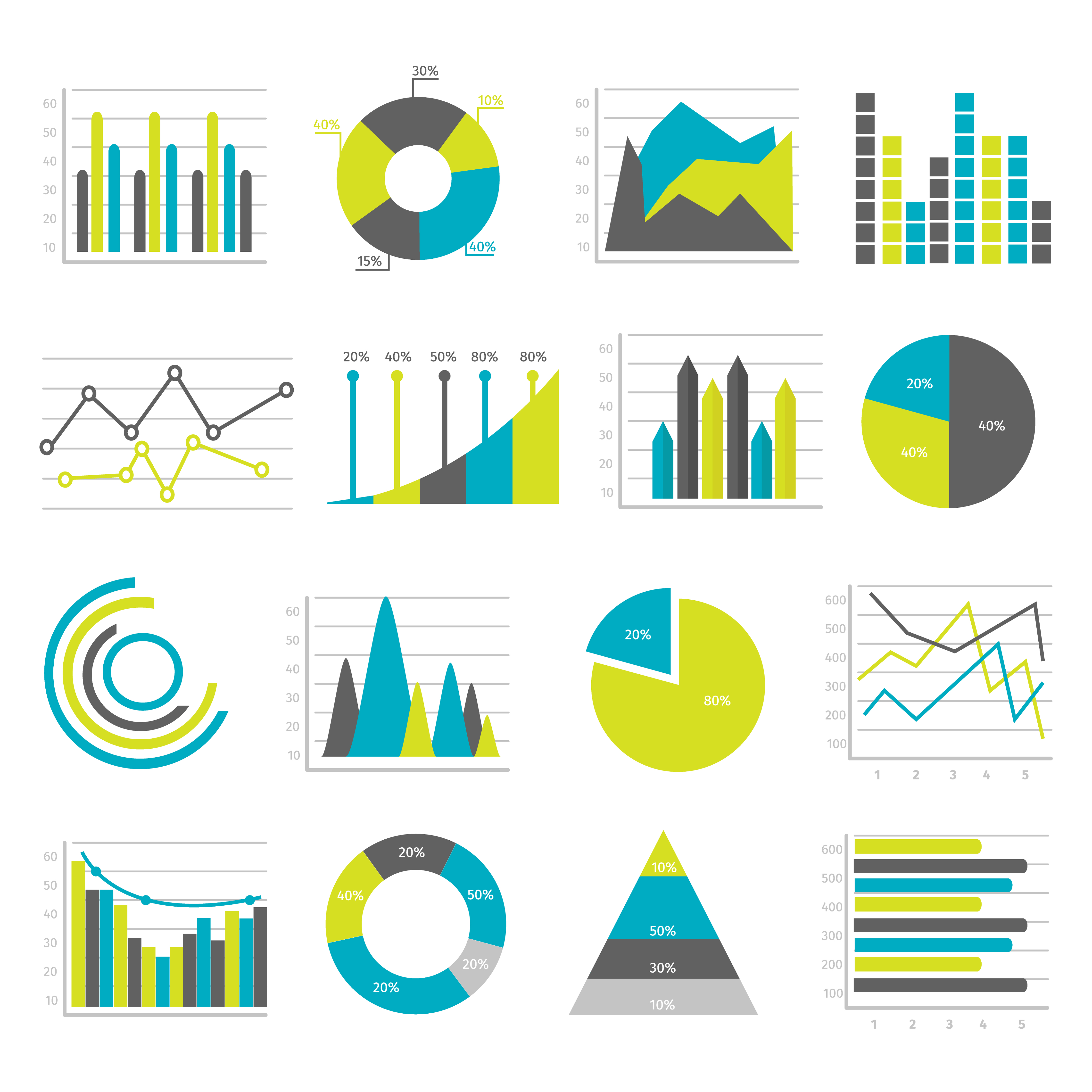
Choose the Right Chart Type:
Selecting the appropriate chart type is crucial for displaying data accurately and facilitating comprehension. Different types of charts, such as line graphs, bar charts, pie charts, scatter plots, and heatmaps, are designed to represent specific data patterns. Consider the nature of your data and the insights you want to highlight when determining the most suitable chart type. This ensures that the chart’s visual representation aligns with the message you intend to convey.
Simplify and Declutter:
Cluttered charts can confuse and overwhelm viewers, making it difficult to extract key information. Keep your charts clean and uncluttered by removing unnecessary elements such as excessive gridlines, redundant labels, or distracting backgrounds. Emphasize the essential elements by using bold colors and appropriate font sizes. When simplifying, ensure that the core message remains intact and easily discernible.
Highlight Key Insights:
Charts should be designed to emphasize the most important information and insights. Use visual cues such as color, size, or annotations to draw attention to key data points, trends, or comparisons. Employing callouts, captions, or data labels strategically can help viewers quickly grasp the significance of specific data elements. Highlighting the main takeaways ensures that your chart delivers the intended message effectively.
Ensure Data Accuracy and Consistency:
Inaccurate or inconsistent data can mislead viewers and undermine the credibility of your charts. Double-check your data sources, calculations, and labels to ensure accuracy. Verify that the chart elements, such as legends, axis labels, and scales, are consistent and clearly reflect the data they represent. When sharing data-driven insights, it is crucial to maintain transparency and uphold the integrity of your charts.
Utilize Appropriate Scaling:
Many one of the strategies to improve chart is by choosing the right scaling for your charts can make a significant difference in how data is perceived. Scaling determines the range and intervals along the axes and can affect the perception of trends, proportions, and relationships. Consider whether linear, logarithmic, or other scaling methods are more suitable for your data. Proper scaling ensures that your charts accurately represent the magnitude and patterns present in the data.
Incorporate Interactive Features:
Interactive charts provide an engaging and dynamic experience for viewers. Incorporate features such as tooltips, drill-down functionality, or filtering options to allow users to explore the data at their own pace. Interactivity promotes deeper engagement, enabling users to discover insights that might otherwise go unnoticed. However, strike a balance between interactivity and simplicity to avoid overwhelming users with unnecessary complexity.
Optimize for Accessibility:
To ensure that your charts are inclusive and accessible to all users, consider implementing accessibility features. Use alt-text descriptions for screen readers to interpret charts for visually impaired individuals. Choose color combinations that provide sufficient contrast and consider alternative methods, such as patterns or textures, for conveying information to users with color blindness. By optimizing for accessibility, you enhance the reach and impact of your charts.
Tell a Story with Data:
Charts are powerful storytelling tools that can communicate narratives and evoke emotions. Craft a narrative around your data by organizing the information in a logical and coherent manner. Use annotations, headings, or captions to guide viewers through the story you want to tell. Combining data with compelling narratives helps create an emotional connection and facilitates better understanding and retention of the information presented.
Conclusion:
Strategies to improve chart is essential for effective data visualization and communication. By choosing the right chart type, simplifying the design, highlighting key insights, ensuring data accuracy, utilizing appropriate scaling, incorporating interactivity, optimizing for accessibility, and crafting a compelling narrative, you can enhance the impact of your charts. Implementing these strategies will empower you to present data-driven insights in a visually appealing and understandable manner, ultimately leading to better decision-making and communication for a wide range of audiences.
Related Articles:
1. 8 tips to make better charts – Quartz
2. How To Make A Chart Attractive In 9 Steps
3. How to Use Charts and Graphs Effectively