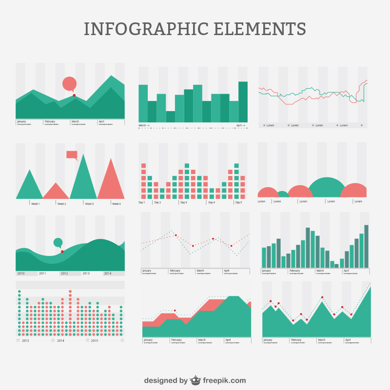
In the digital age, data is king. We generate massive amounts of data every day, from website traffic and social media interactions to financial transactions and scientific research. However, data alone is not very informative unless we can make sense of it. This is where data visualization comes into play. Data visualization is the art and science of presenting data in a visual format, making it easier to understand, analyze, and derive insights from. In this article, we will explore the 16 best types of charts and graphs for data visualization, helping you choose the right one for your data presentation needs.

Bar Charts
Bar charts are one of the most common and straightforward types of charts for data visualization. They are used to display categorical data with rectangular bars of varying lengths, where the length of each bar represents the value it represents. Bar charts are excellent for comparing data across different categories and identifying trends or outliers.
Line Charts
Line charts are ideal for showing trends and changes over time. They connect data points with lines, allowing viewers to observe how values evolve. Line charts are commonly used for tracking stock prices, temperature fluctuations, or any data that exhibits a continuous progression.
Pie Charts
Pie charts are perfect for displaying parts of a whole. They divide a circle into slices, with each slice representing a portion of the total value. Pie charts are intuitive for understanding the distribution of categories within a dataset, but they can be less effective for comparing values.
Scatter Plots
Scatter plots are used to visualize relationships between two variables. Each point on the plot represents a data point, with one variable on the x-axis and the other on the y-axis. Scatter plots are excellent for identifying correlations, clusters, or outliers in data.
Histograms
Histograms are used to display the distribution of a dataset. They group data into bins or intervals and represent the frequency or count of data points within each bin. Histograms are valuable for understanding the shape and spread of data, particularly in statistical analysis.
Area Charts
Area charts are similar to line charts but with the area below the lines filled in with color. They are useful for visualizing cumulative data or stacked values over time. Area charts can help identify patterns in data and highlight changes in composition.
Heatmaps
Heatmaps use color to represent the density or intensity of data points within a grid or matrix. They are particularly useful for visualizing large datasets and identifying patterns or anomalies. Heatmaps are commonly used in fields like biology and data analytics.
Bubble Charts
Bubble charts are an extension of scatter plots, with an additional dimension represented by the size of the bubbles. They are ideal for visualizing data with three variables, where the x and y axes represent two variables, and the size of the bubbles represents the third variable.
Radar Charts
Radar charts, also known as spider charts, are used to compare multiple variables for a single data point. Each variable is represented as a spoke radiating from a central point, and the length of each spoke corresponds to the value of that variable. Radar charts are great for visualizing multivariate data.
Box Plots (Box-and-Whisker Plots)
Box plots provide a graphical summary of the distribution of data. They display the median, quartiles, and potential outliers in a dataset. Box plots are valuable for identifying skewness, variability, and the overall spread of data.
Gantt Charts
Gantt charts are widely used in project management to display tasks, their durations, and dependencies over time. They are excellent for visualizing project schedules, resource allocation, and progress tracking.
Sankey Diagrams
Sankey diagrams visualize the flow of resources or quantities from one category to another. They are effective for illustrating the distribution of energy, material, or information in a system, making them valuable in fields like environmental science and economics.
Pareto Charts
Pareto charts combine bar graphs with a line graph and are used to prioritize tasks or issues based on their importance. They help identify the most significant factors contributing to a problem or goal, aiding in decision-making.
Tree Maps
Tree maps display hierarchical data structures as nested rectangles, with each level of the hierarchy represented by a larger rectangle. They are useful for visualizing the composition of data and hierarchical relationships, such as organizational structures or file directories.
Word Clouds
Word clouds are visual representations of text data, where words are sized proportionally to their frequency in the text. They are often used to highlight keywords or themes in textual data, making them popular in content analysis and sentiment analysis.
Choropleth Maps
Choropleth maps use color shading or patterns to represent data values in geographic regions, such as countries or states. They are effective for displaying regional variations and patterns in data, such as population density, election results, or economic indicators.
Conclusion
Data visualization is an indispensable tool in the modern world, helping us make sense of the vast amounts of data we generate daily. Choosing the right type of chart or graph for your data presentation needs is crucial for effective communication and decision-making. Whether you’re analyzing sales trends, tracking project progress, or exploring complex datasets, the 16 types of charts and graphs mentioned in this article provide a versatile toolkit for creating informative and visually appealing data visualizations. By selecting the most appropriate visualization method, you can convey your insights clearly and engage your audience effectively in the world of data.
Related Articles:
1. See 20 Different Types Of Graphs And Charts With Examples
2. 44 Types of Graphs & Charts [& How to Choose the Best One]
3. 20 Essential Types of Graphs and When to Use Them


