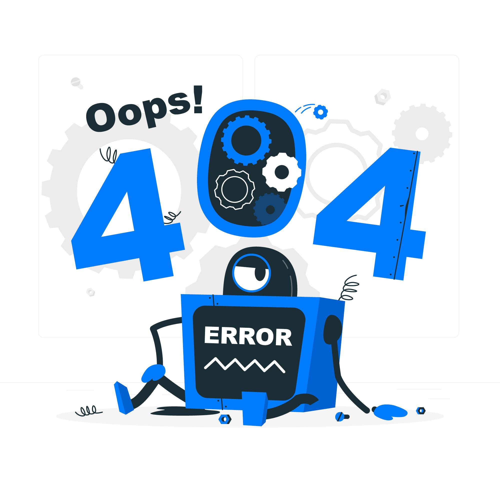
In the vast landscape of the internet, where billions of webpages are just a click away, encountering a 404 error page can be both frustrating and disheartening. As users, we’ve all experienced that moment when excitement turns into disappointment as we’re met with the infamous “404 – Page Not Found” message. However, what many may not realize is that 404 error pages are not just dead ends – they are opportunities for creativity, branding, and enhancing user experience. In this comprehensive guide, we’ll explore the world of 404 error pages, their significance, and how to create effective and engaging ones that turn a negative experience into a positive interaction.

Understanding 404 Error Pages
A 404 error page is a response code that indicates the requested webpage could not be found on the server. This can happen for various reasons: a mistyped URL, a deleted page, or a broken link. When a user encounters a 404 error page, it means that the server was reached successfully, but the specific page they were looking for isn’t available.
The Significance of Custom 404 Error Pages
Default 404 error pages are often plain, uninspiring, and provide minimal guidance to users. They can leave visitors confused and frustrated, prompting them to leave your website altogether. This is where custom 404 error pages come into play. By creating a custom 404 error page, you have the opportunity to not only guide users back on track but also engage and entertain them.
Creating an Effective Custom 404 Error Page
1. Clear Messaging: The first and most important aspect of a custom 404 error page is clear messaging. Users should immediately understand that they’ve landed on an error page and what they can do next. Use concise language that conveys the situation while maintaining your brand’s tone.
2. Navigation: Provide alternative navigation options to help users find what they’re looking for. Include links to your homepage, popular pages, and search bar. This can guide users to relevant content instead of leaving them stranded.
3. Visual Appeal: A visually appealing design can soften the blow of encountering an error. Incorporate your brand’s colors, fonts, and imagery to maintain consistency and make the error page an extension of your website.
4. Humor and Creativity: Injecting a dose of humor or creativity can turn a negative experience into a positive one. However, it’s essential to strike a balance – ensure that the humor aligns with your brand and is appropriate for your target audience.
5. Useful Information: Offer solutions or suggestions to help users navigate away from the error page. This could include links to popular categories, recent articles, or a FAQ section.
6. Contact Information: If users can’t find what they’re looking for, give them the option to reach out for assistance. Provide a link to your contact page or customer support.
Examples of Memorable 404 Error Pages
1. GitHub: The coding platform GitHub’s 404 error page features a simple, interactive animation of a lost astronaut. It not only reflects the platform’s tech-oriented nature but also adds an element of playfulness.
2. LEGO: LEGO’s 404 page uses humor by showing a broken LEGO brick and the message “Oops, that brick is missing!” This approach resonates with their product while acknowledging the error.
3. Blue Fountain Media: This digital agency uses a vibrant and visually appealing 404 page that includes a search bar and links to popular content. The use of color and design maintains the brand’s creative identity.
4. Airbnb: Airbnb’s 404 error page incorporates their global travel theme by showing a world map with animated paper airplanes flying across it. The page also offers links to popular destinations.
SEO Optimization for 404 Error Pages
SEO optimization isn’t just limited to regular webpages – it applies to 404 error pages as well. Here’s how to ensure your custom error page is search engine friendly:
1. Meta Tags: Include relevant meta tags, including a title and description that inform users about the error and guide them back to your site’s main content.
2. Noindex Tag: While you want your error page to be accessible, you don’t want it indexed by search engines. Adding a “noindex” meta tag prevents search engines from crawling and indexing your error page.
3. Internal Links: Link to important pages on your website, directing users and search engines to relevant content. This can help with user retention and SEO.
4. Optimize Images: If your error page includes images, optimize them for web use to ensure quick loading times. Page speed is a ranking factor for search engines.
Conclusion
404 error pages are not the end of the road – they’re opportunities to showcase your brand’s personality, guide users back to valuable content, and even turn a negative experience into a memorable one. By creating custom 404 error pages that combine clear messaging, navigation options, creativity, and SEO optimization, you can enhance user experience, retain visitors, and reinforce your brand identity. So, the next time a user stumbles upon a 404 error page, they might just leave with a smile and a greater appreciation for your website.
Related Articles:
1. The Ultimate Guide to 404 Pages for WordPress
2. 21 Stunning 404 Pages to Convert Lost Visitors [2023]
3. Everything You Need to Know About the 404 Page


